The Jack Henry Rebrand: Modernizing a Legacy Brand
Modernizing a Legacy Brand
The new Jack Henry brand is driven by purpose and mission, but that’s also true of the company when it was first founded. Jack Henry & Associates, Inc.® was founded in 1976 in Monett, Missouri by Jack Henry and Jerry Hall. Their vision: help financial institutions strengthen the connections they had with the people and businesses they served with a keen focus of user centricity.
That vision set the foundation for the well-respected B2B fintech company that Jack Henry is today. Thanks in large part to the ambition and hard work of Jack Henry associates, the values, ideals, and philosophy set forth by Jack and Jerry live on and continue to be a cornerstone of the organization’s success.
When reimagining this legacy brand, honoring our company history and foundations were a definite must. Even now, the Jack Henry founding philosophy is consistently referenced by associates in all levels of the organization with pride: do the right thing, do whatever it takes, and have fun.

Getting the House in Order
Over the decades, Jack Henry & Associates, continued to grow and the company acquired and merged with other brands. By the time we were ready for a rebrand, Jack Henry had become an umbrella brands with multiple and varied brands existing in silos.
The company was known by its divisions more so than one organization, depending on the specific client base:
Jack Henry Banking – for banking core clients
Symitar – for credit union core clients
ProfitStars – for non-core clients using our complementary solutions
This approach resulted in heavily segmented approaches in how we communicated with clients, and how we operated internally from a marketing and creative perspective. This also resulted in developing marketing campaigns and maintaining branding for each of the three divisions, as well as the corporate umbrella brand of Jack Henry & Associates, Inc. These efforts resulted in inefficiencies, redundancies, and increased workloads by having to maintain multiple versions of different branding, marketing campaigns, and strategies. It also contributed to a diffusion of our brand awareness and perception in the fintech industry.
To truly reinvent the company and our image, we knew we’d need to overcome this brand confusion to become who we are today – one singular brand, one Jack Henry – a well-rounded financial technology company.
This branding approach provided a unique opportunity to craft a fresh new message with a distinct personality, completely authentic to who we are today while still honoring our past and foundations as we lean into a purpose driven future.
A Brand Evolution
Being a legacy brand, there were challenges for Jack Henry overall. However, the foundations and the internal sentiments about the company or strong, and with a rich history in the fintech world, we wanted to make sure that we honored our past as we stepped into the future. The team truly saw this as a brand evolution, and not a revolution. It wasn’t a departure or rejection of the brand’s heritage. Instead, it was a natural and necessary next step for Jack Henry. To help us on this journey, the in-house Jack Henry creative and marketing teams partnered with SagePath, an Atlanta-based digital agency, and together, we shaped the new Jack Henry brand.
A Bold New Look: Visual Brand Identity
Logo
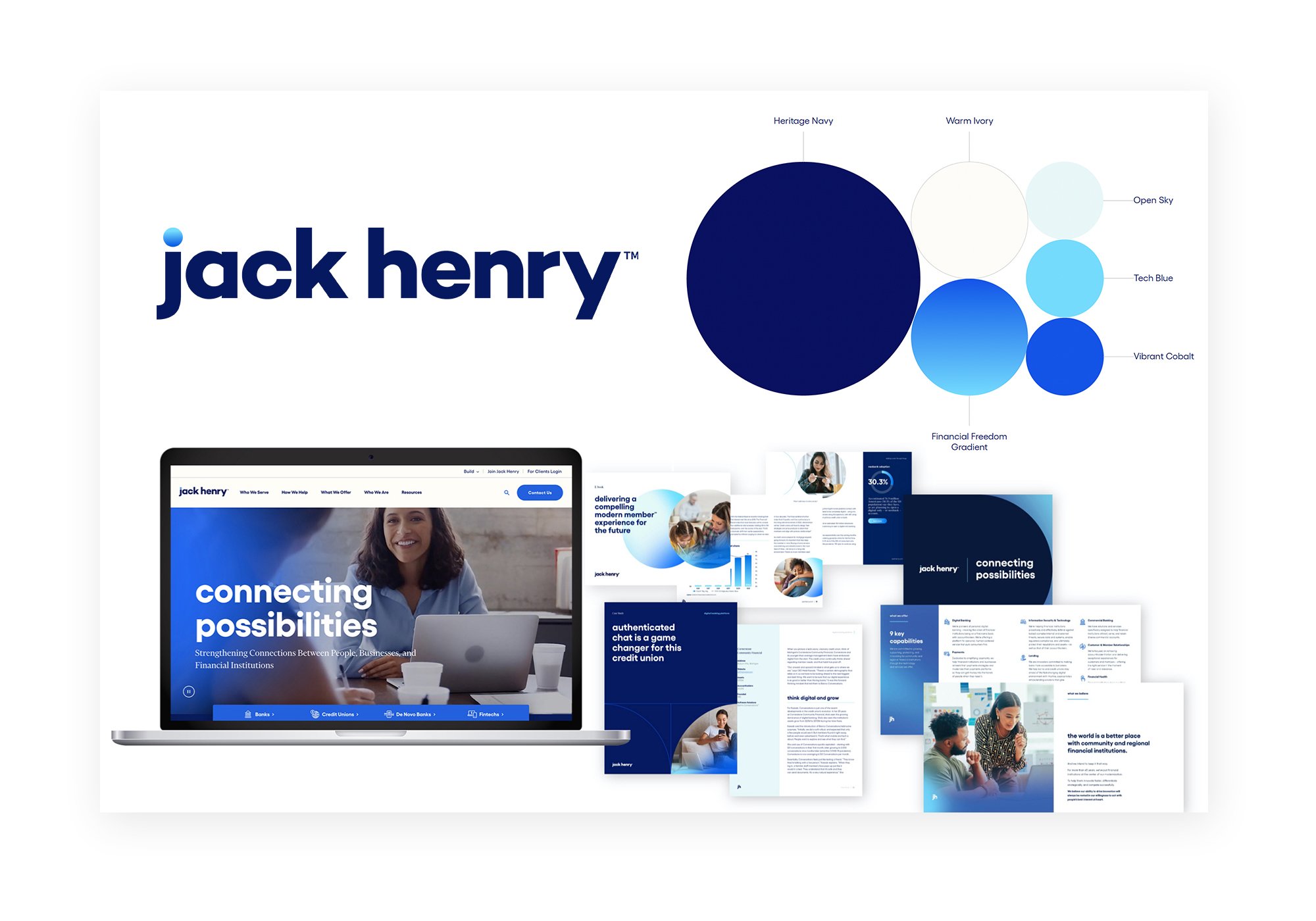
The Jack Henry logo is modern yet bold and approachable, using all lowercase letters in a san serif font. The key element that makes this logo unique is the dot over the “j,” which symbolizes our well- rounded ecosystem of diverse ideas, thoughts, capabilities, and experiences collaborating to create new connections.

Colors
Our color palette has become an ownable styling for the brand. The anchor of the Jack Henry palette is Heritage Navy. As our hero color, this classic navy blue is an evolution of the original Jack Henry brand color, now updated in tone for better usability and harmony with the other brand colors: Vibrant Cobalt, Tech Blue, Open Sky, Warm Ivory, and our Financial Freedom gradient.
Typography
Using the geometric sans serif Gellix as our primary typeface creates a look and feel that is easy to understand, modern, and bold. A unique styling of our headlines in our branding is the use of lowercase, bold Gellix text. This approach provides a unique way of presenting big ideas while also visually connecting with our logo and creating a modern, human-centric vibe. As a secondary typeface, Financier Display is used which adds a touch of formality to the brand in our subheadings.
Learn more about the new Jack Henry visual brand identity here.

One Brand, One Voice: The Jack Henry Brand Voice & Personality
Our brand voice is the way we talk to our clients, our partners, our Associates, and our shareholders. At Jack Henry, our voice is that of an advocate with a true focus on people. We understand the needs, goals, and values of our audiences and work alongside them, guiding them technology, services, resources, and advice to help them move forward.
The Jack Henry personality characteristics are a reflection of who we are, and when combined with our brand voice, helps us to build long-lasting and successful relationships, both with our internal and external audiences.
confident
empowering
accessible
empathetic
genuine
dynamic
People-Inspired Innovation
Identifying the Jack Henry purpose and mission as an organization was vital and would go on to inform how we approached many of our strategies and audience touchpoint, corporate programs, etc.
At Jack Henry, we truly are driven by people, and people are at the center of everything that we do – from our clients and their customer and members, to our associates, and shareholders.
With our people-centric approach combined with the services and innovation Jack Henry provides, a common thread of financial health became apparent and recognizing the importance of financial health for people everywhere. This became the foundation of our purpose and mission.
Jack Henry's purpose is simply stated as such: we empower people and committees with the financial freedom to move forward. And our mission further dives into that vision: we strengthen the connection between people and their financial institutions to technology and services that reduce the barriers to financial health.
Connecting Possibilities
With the Jack Henry foundational brand elements determined, the next step would be crafting how we go to market and launch. Thus, the creative platform of “Connecting Possibilities” was developed.
At Jack Henry, we’re connecting possibilities to make something bigger – to innovate because of and for people. Our creative platform is how we express our brand and is our opportunity to communicate our people-inspired innovation.
This also encompassed how we visually present the Jack Henry story to the world. It’s how we connect the brand story to the brand personality – with an elevated approach that makes our brand stand out, featuring beautiful people-centric and candid photos, the Jack Henry brand colors, our bold and balanced typography style, and circle-inspired line art and graphical elements.
And it doesn’t stop there. With these foundational brand elements, all of the Jack Henry branding and touchpoints were redesigned. Explore more of the work on my portfolio page here.


Bringing All the Pieces Together
Along with our foundational elements, key materials were created and updated with the new branding in preparation for the launch of the new Jack Henry brand.
This massive undertaking of producing the creative tactics and content to support the launch was challenge the in-house Creative team at Jack Henry was ready for. Together, my team and I created and updated 2,500+ items, including, but certainly not limited to: website assets and copy, images, icons, templates, collateral content pieces like case studies and white papers, emails, digital ads, print ads, brand creative guides, videos, mailers, and social media creative.
One of the most necessary of deliverables for the Jack Henry rebrand would be our all new corporate website which was developed in partnership with SagePath. This modern B2B, responsive, full-featured website – jackhenry.com – was built from the ground up and guided by our new brand strategy and standards. It was also integrated with our marketing automation platform for insights into our site visitors.
For the rebrand launch on August 1, 2022, our public-facing efforts went live and garnered tremendous positive buzz for the company. Following the launch, Jack Henry then continued the celebration with the inaugural Jack Henry Connect client conference in San Diego on August 28th. The event featured a new look and branding tied directly to the jack Henry rebrand efforts and a fully-redesigned booth and attendee experience.
The Results
The success of our rebrand efforts was evident in key metrics captured in the weeks after the launch:
Engagement increases in our four social media channels:
65.2% (87,003) total increase in total engagements
50.9% total increase in engagement rate per impression
34% (7,564) total increase in total net audience
9.4% (1,203,915) total increase in total impressions
3,684 people engaged with the rebrand announcement press release on social media
Increase in Website engagement:
Total website page views per week: started at 68,630 (3X the historical average) leveling off at 44,276 weekly average (2X the historical average)
Average session time: 9:25 (versus 1:11 historical average)
1,073 Sales inquiry form submissions
Increase in attendance to annual client conference: Jack Henry Connect
2,405 client attendees (up 9% from previous year)
Increase in Internal engagement:
Annual Associate Town Hall – 14% increase in attendance/viewership
Redesigned Intranet – 36% increase in daily unique visitors
And the Winner is …
The Jack Henry rebrand also garnered several creative and marketing awards including:
2023 American Business Awards – Silver Stevie: Brand Renovation of the Year
2023 Platinum Hermes Creative Awards Winner: Strategic Marketing Campaign – Branding Refresh
2023 Gold Hermes Creative Awards Winner: Website Redesign
2023 Gold MUSE Award Winner: Corporate Identity Redesign
2023 Gold MUSE Award Winner: B2B Website
2023 Golden Bridge Business and Innovation Awards – Bronze GLOBEE Winner: Re-Branding Marketing Campaign of the Year
Looking Forward as the Brand Grows
As any smart creative knows, branding is never a “one and done” scenario. At Jack Henry, we’re constantly thinking about how to further the brand’s reach, evolve our creative and brand voice, and push the boundaries of the branding as the organization and its needs continue to grow. I’m incredibly proud of the work we’ve accomplished through this reimagining of a respected legacy brand.
Now with a solid foundation as our brand’s home base, we can explore new avenues and opportunities for our branding, adapt and evolve our standards as needed, work on new creative strategies to appeal to our key audiences, and continue to foster and guide the Jack Henry brand’s development into the future.
Connect with me on LinkedIn and visit my website’s portfolio page to keep up with the latest highlights from me and the in-house creative team at Jack Henry.